Key Takeaways
- Understanding the color wheel is essential for crocheters to grasp the basics of color theory.
- Exploring primary, secondary, and tertiary colors can help crocheters create harmonious color combinations in their projects.
- Mastering complementary and analogous color schemes can elevate the visual appeal of crochet projects.
- Incorporating warm and cool tones can add depth and dimension to crocheted items.
- Balancing light and dark shades is crucial for creating contrast and visual interest in crochet designs.
Understanding the Color Wheel
Crochet is not just about the intricate stitches and patterns; it’s also a canvas for artistic expression through the use of color. To truly master the art of crochet, it’s essential to understand the foundations of color theory. The color wheel is the cornerstone of this knowledge, providing a visual representation of the relationships between different hues.
At the heart of the color wheel lies the primary colors: red, yellow, and blue. These three colors form the basis for all other hues, and by understanding their interactions, crocheters can unlock a world of creative possibilities. The secondary colors, which are created by mixing two primary colors, and the tertiary colors, formed by combining a primary and a secondary color, further expand the color palette. Recognizing these relationships is crucial for crocheters who wish to design projects that are visually striking and harmonious.
Delving deeper into the color wheel, crocheters can explore the nuances of color theory and how it can elevate their projects. By understanding the dynamics between complementary colors, which sit opposite each other on the wheel, and analogous colors, which are adjacent, crocheters can create designs that evoke specific moods and emotions. This knowledge empowers them to make informed decisions about color choices, ensuring that their crochet pieces not only showcase their technical skills but also convey a strong aesthetic vision.
Exploring Primary, Secondary, and Tertiary Colors
At the heart of color theory are the three primary colors: red, yellow, and blue. These hues are the building blocks of the color spectrum, and by understanding their unique characteristics, crocheters can unlock a world of creative possibilities.
Red, the most intense and energetic of the primary colors, is often associated with passion, excitement, and power. Incorporating red into crochet projects can add a bold and vibrant touch, drawing the eye and commanding attention. Yellow, on the other hand, is the lightest and most luminous primary color, evoking feelings of warmth, optimism, and joy. Crocheters can use yellow to create projects that radiate a sense of cheerfulness and positivity. Blue, the final primary color, is often linked to calmness, stability, and trust. By incorporating blue into their crochet designs, crocheters can create a soothing and serene atmosphere.
Beyond the primary colors, the secondary colors – orange, green, and purple – offer a wealth of creative possibilities. Orange, a blend of red and yellow, combines the energy of red with the warmth of yellow, creating a hue that is both vibrant and inviting. Green, a mixture of blue and yellow, represents growth, harmony, and nature, making it a versatile choice for crochet projects. Purple, a blend of red and blue, is often associated with royalty, creativity, and spirituality, adding a touch of elegance and sophistication to crochet designs.
Tertiary colors, formed by combining a primary and a secondary color, further expand the color palette available to crocheters. These nuanced hues, such as yellow-orange, blue-green, and red-purple, allow for more subtle and complex color combinations, enabling crocheters to create projects that are visually captivating and unique.
Mastering Complementary and Analogous Color Schemes
Crocheters who truly want to elevate their projects must delve deeper into the principles of color theory, exploring the concepts of complementary and analogous color schemes.
Complementary colors are those that sit opposite each other on the color wheel, such as red and green, blue and orange, or yellow and purple. These hues create a striking contrast that can add visual drama and energy to crochet designs. By pairing complementary colors, crocheters can create projects that immediately capture the viewer’s attention, drawing the eye and creating a sense of visual tension. This technique is particularly effective when used in bold, high-contrast designs or when crocheters want to make a bold statement with their work.
In contrast, analogous colors are those that are adjacent on the color wheel, such as blue, blue-green, and green, or red, red-orange, and orange. These harmonious hues create a sense of cohesion and unity, resulting in designs that are visually soothing and calming. Crocheters who incorporate analogous color schemes into their projects can create a sense of flow and harmony, allowing the viewer’s eye to move seamlessly across the design. This approach is well-suited for projects that aim to evoke a sense of tranquility or natural beauty.
By mastering the use of complementary and analogous color schemes, crocheters can unlock a wealth of creative possibilities. Whether they choose to create bold, high-contrast designs or opt for a more harmonious, calming aesthetic, understanding these color relationships empowers them to make informed decisions that elevate their crochet projects to new heights.
Incorporating Warm and Cool Tones
| Color Theory Concept | Explanation |
|---|---|
| Primary Colors | Red, blue, and yellow are the three primary colors that cannot be created by mixing other colors. |
| Secondary Colors | Orange, green, and purple are created by mixing two primary colors together. |
| Color Harmony | Using complementary, analogous, or triadic color schemes to create visually pleasing combinations. |
| Value | The lightness or darkness of a color, which can create contrast and depth in a project. |
| Saturation | The intensity or purity of a color, which can impact the overall vibrancy of a project. |
Color theory extends beyond the relationships between hues on the color wheel; it also encompasses the distinction between warm and cool tones. Understanding this fundamental concept is crucial for crocheters who wish to create visually striking and emotionally resonant designs.
Warm colors, such as red, orange, and yellow, are often associated with feelings of energy, passion, and vibrancy. These hues have the ability to draw the eye and create a sense of warmth and comfort. Crocheters who incorporate warm tones into their projects can evoke a sense of coziness, inviting the viewer to engage with the piece on a deeper level. Whether it’s a vibrant red afghan or a sunny yellow throw, warm colors have the power to transform a crochet project into a visual and tactile delight.
In contrast, cool colors, including blue, green, and purple, are often linked to feelings of calmness, serenity, and introspection. These hues have a soothing and calming effect, creating a sense of tranquility and balance. Crocheters who utilize cool tones in their designs can create projects that exude a sense of peace and relaxation, allowing the viewer to find respite and solace in the intricate stitches.
By understanding the emotional and psychological impact of warm and cool tones, crocheters can make informed decisions about their color choices, ensuring that their projects not only showcase their technical skills but also evoke specific moods and feelings. Whether they choose to create a vibrant, energetic design or a serene, calming piece, the strategic use of warm and cool colors can elevate the overall aesthetic and impact of their crochet work.
Balancing Light and Dark Shades

Color theory is not just about the hues themselves; it also encompasses the concept of value, or the lightness and darkness of a color. Mastering the balance between light and dark shades is a crucial aspect of crochet design, as it can create depth, dimension, and visual interest.
Lighter shades, often referred to as tints, have a higher value and can create a sense of airiness and luminosity in a crochet project. These hues can be used to highlight specific elements, draw the eye to particular areas, and create a sense of lightness and brightness. Crocheters who incorporate light shades into their designs can create a sense of openness and spaciousness, evoking feelings of joy and optimism.
In contrast, darker shades, known as tones or shades, have a lower value and can add depth, drama, and sophistication to a crochet piece. These hues can be used to create shadows, add depth, and provide a sense of grounding and stability. Crocheters who utilize darker shades in their projects can create a sense of richness and elegance, evoking feelings of calmness and introspection.
By carefully balancing light and dark shades within their crochet designs, crocheters can create a sense of visual depth and dimension, guiding the viewer’s eye through the intricate stitches and patterns. This mastery of value can transform a simple crochet project into a work of art, showcasing the crocheter’s understanding of color theory and their ability to manipulate light and shadow to create visually stunning designs.
Experimenting with Monochromatic Palettes
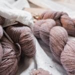
In the world of crochet, the use of monochromatic color schemes can be a powerful tool for creating visually striking and cohesive designs. A monochromatic palette is one that utilizes various shades, tints, and tones of a single hue, creating a unified and harmonious aesthetic.
Embracing a monochromatic approach to crochet design can be a liberating and rewarding experience for crocheters. By focusing on a single color, they can explore the nuances and subtleties of that hue, experimenting with different shades and values to create depth, texture, and visual interest. This technique can be particularly effective for projects that aim to showcase the intricate stitches and patterns of crochet, as the focus remains on the craftsmanship rather than being overshadowed by a complex color scheme.
Moreover, monochromatic palettes can evoke a sense of serenity and sophistication, making them well-suited for projects that are intended to create a calming and elegant atmosphere. Crocheters can choose to work with a range of tints and shades within a single color family, or they can opt for a more dramatic approach by incorporating both light and dark values to create a striking contrast.
By embracing the versatility of monochromatic color schemes, crocheters can unlock a world of creative possibilities. Whether they choose to work with a soothing blue palette or a bold, vibrant red, the strategic use of a single hue can elevate their crochet projects, showcasing their technical skills and artistic vision in a cohesive and visually captivating manner.
Leveraging Color Contrast for Visual Interest
In the realm of crochet design, the strategic use of color contrast can be a powerful tool for creating visually striking and engaging projects. Color contrast, the difference in hue, value, and intensity between colors, can be used to draw the eye, create focal points, and add depth and dimension to a crochet piece.
High-contrast color schemes, where colors that are vastly different in hue, value, or intensity are paired together, can create a bold and dramatic effect. This approach can be particularly effective for projects that aim to make a strong visual statement, such as vibrant afghans or eye-catching accessories. By juxtaposing complementary colors or combining light and dark shades, crocheters can create a sense of visual tension and energy that immediately captures the viewer’s attention.
On the other hand, low-contrast color schemes, where colors are more closely related on the color wheel or have similar values, can create a sense of harmony and cohesion. This approach can be well-suited for projects that are intended to evoke a sense of tranquility and relaxation, such as soothing baby blankets or cozy throws. By utilizing analogous colors or subtle variations within a monochromatic palette, crocheters can create a visually pleasing and calming aesthetic.
Regardless of the specific approach, the strategic use of color contrast can be a powerful tool for crocheters who wish to elevate their projects. By understanding the impact of high and low contrast, crocheters can make informed decisions about their color choices, ensuring that their designs not only showcase their technical skills but also captivate the viewer and evoke the desired emotional response.
Choosing Colors that Evoke Specific Moods
In the world of crochet, the strategic use of color can be a powerful tool for evoking specific moods and emotions. Color theory, with its understanding of the psychological and emotional impact of different hues, can be a valuable resource for crocheters who wish to create projects that resonate on a deeper level.
Certain colors are often associated with particular emotions and feelings. For example, warm colors like red, orange, and yellow can evoke a sense of energy, passion, and optimism, while cool colors like blue, green, and purple can convey a sense of calmness, serenity, and introspection. By understanding these associations, crocheters can make informed decisions about their color choices, ensuring that their projects not only showcase their technical skills but also elicit the desired emotional response from the viewer.
Moreover, the strategic use of color can also be used to create a sense of cohesion and unity within a crochet project. By selecting a color palette that aligns with the intended mood or theme of the piece, crocheters can create a harmonious and visually compelling design. Whether it’s a cozy, earthy-toned afghan or a vibrant, cheerful baby blanket, the intentional use of color can elevate the overall impact and emotional resonance of the crochet work.
By embracing the power of color theory, crocheters can unlock a world of creative possibilities. By understanding the emotional and psychological impact of different hues, they can make informed decisions about their color choices, ensuring that their projects not only showcase their technical skills but also evoke specific moods and feelings within the viewer. This mastery of color can transform a simple crochet project into a work of art, captivating the senses and leaving a lasting impression.
Applying Color Theory to Crochet Project Design
As crocheters delve deeper into the world of color theory, they can begin to integrate these principles into the design process, elevating their crochet projects to new heights of artistic expression.
The first step in this journey is to experiment with different color combinations and schemes, exploring the relationships between hues and the emotional impact they can have. Crocheters can start by creating color palettes that incorporate complementary, analogous, or monochromatic colors, observing how these choices affect the overall aesthetic and mood of their designs. This hands-on exploration allows them to develop a deeper understanding of color theory and how it can be applied to their crochet work.
As crocheters become more comfortable with the principles of color theory, they can begin to intentionally incorporate these concepts into the design process. This may involve carefully selecting a color scheme that aligns with the intended purpose or theme of the project, or it may involve strategically using color contrast to draw the viewer’s eye and create a sense of visual interest. By making informed decisions about their color choices, crocheters can ensure that their projects not only showcase their technical skills but also convey a strong artistic vision.
Ultimately, the application of color theory to crochet project design is a journey of experimentation and self-discovery. As crocheters continue to explore the nuances of hue, value, and intensity, they can develop a personal color aesthetic that reflects their unique creative voice. Whether they choose to create bold, high-contrast designs or opt for a more harmonious, calming aesthetic, the strategic use of color can elevate their crochet projects, transforming them into works of art that captivate the senses and evoke powerful emotional responses.